Post by : Anees Nasser
Anticipation builds for Google’s forthcoming Android 17, expected to incorporate elements from one of Apple's most debated updates: the translucent, blur-laden interface introduced in iOS 26. Early internal builds indicate that this new version might sport blurred menus and system UI components, a style that has drawn both admiration and criticism from Android users in the past.
This anticipated design shift represents a significant transition in Android's visual approach, potentially merging the identities of the two leading mobile operating systems. This raises pertinent questions: does this style enhance the user experience, or does it replicate a design flaw that many have found limiting?
Reports on prospective features for Android 17 suggest:
Blurred Menus: Expect to see standard solid backgrounds in essential menus—including power controls and volume settings—transformed into semi-transparent, blurred backdrops, revealing underlying wallpaper or content.
Dynamic Influence: The blur effect may adapt based on user-selected themes, with Google’s Dynamic Color system affecting the transparency levels.
Homescreen Cohesion: On the homescreen, these blurred elements could unify with app icons and backgrounds, pushing Android's aesthetic closer to that of its competitors.
While expected to be less drastic than the shift from iOS 18 to iOS 26, this evolution hints that Google is inclined to experiment with bolder design choices beyond the minimalist trends dominating recent Android versions.
Historically, Android and iOS have been characterized by distinctive design philosophies. Android has championed a Material Design language focused on clarity and depth, whereas Apple’s recent visuals have leaned towards a translucent, layered aesthetic.
If Android 17 integrates these blur effects:
Design Convergence: This shift reflects a growing trend of cross-platform visual influences, where innovations in one system influence others—sometimes favorably, sometimes not.
User Reactions: Users who appreciate clear, functional designs might view the embrace of this aesthetic with skepticism, particularly if it recalls criticism previously aimed at iOS for reducing visibility.
Style vs. Utility: This evolution sparks a wider discourse on software design regarding the balance between visual experimentation and maintaining usability.
Instances of design convergence are not unprecedented—Android has adopted gesture navigation following Apple's innovations—but the subjective nature of blurred effects raises questions regarding their impact on usability.
Apple's Liquid GlassX UI in iOS 26 introduced blurred effects that have met mixed responses. Critics point out several drawbacks:
Readability Concerns: The added transparency often complicates text and icon visibility against shifting backgrounds.
Visual Clutter: The excessive layering may detract focus from essential content.
Divided Opinions: While some appreciate the fresh aesthetics, others criticize it as unnecessary embellishment prioritizing style over substance.
Discussions on social platforms have echoed this split, with some users describing the design as “refreshing” while others warn of a setback in clarity.
To accommodate varied user preferences, Apple introduced settings options in subsequent updates to adjust blur effects, acknowledging the mixed reception.
Implementing iOS-style blur in Android is more intricate than mere imitation; it illustrates the shifting design philosophies across ecosystems. Potential scenarios include:
Selective Blur Applications: Google might strategically use blurred backgrounds to maintain readability and performance.
Dynamic Adjustments: By adapting blur levels to user themes, Android 17 might tackle visibility issues better than iOS 26 has.
Customization Potential: Offering users the power to toggle blur effects or adjust their intensity could balance aesthetics with performance.
There’s also the possibility that such design elements might be phased out before the public release, as leaked designs often remain in flux.
Tech users are sharing opinions on the possibility of this new blurred approach:
Cautious Observers: Some Android aficionados feel this could be a fad-based move rather than a focus on practical usability.
Visual Advocates: Others welcome the prospect, hopeful it might render Android’s UI more modern and fluid if executed wisely.
Importance of Context: Users assert that Android's diverse hardware ecosystem necessitates ensuring UI changes do not compromise performance or accessibility.
The essential question remains: do users favor UI designs that embrace more “translucency”, or do they favor Android's historically crisp and functional interfaces?
While the blurred interface is garnering substantial attention, Android 17 is poised to introduce an array of other enhancements as details continue to emerge. These might include:
Updated System Tools: Improvements in screen recording, app privacy options, and system efficiency.
Material Design Refinements: Further honing of Google’s Material design with more seamless animations and cohesive themes.
Customization Options: Enhanced user control over themes and UI elements, potentially linked to dynamic color offerings.
The introduction of this blur effect may merely hint at a wider design evolution aimed at ensuring Android remains visually compelling and competitive.
The potential inclusion of blurred effects in Android highlights a broader trend in UI design:
Depth Over Flatness: Many platforms aim to introduce depth and hierarchy while avoiding overwhelming users.
Crossover Influence: Different systems inspire each other, with Android frequently adapting designs established by Apple.
Striking a Balance: Future UIs must harmonize visual expressiveness with clarity, accessibility, and user performance.
With increasing screen sizes and pixel precision, developers are challenged to create interfaces that are not only aesthetically pleasing but also user-friendly—finding this balance is an ongoing challenge.
Google’s potential integration of blur and semi-transparent elements into Android 17 marks an intriguing, possibly polarizing trajectory for the OS's design. While Apple’s Liquid Glass UI has elicits mixed feedback, its influence appears steadily extending beyond Apple's territory and into the wider smartphone environment.
The real determination of whether this design trend will enhance Android’s user experience or yield the same critiques faced by iOS lies in the thoughtful application of these effects and the level of control granted to users. The Android community watches keenly, curious whether this direction proves advantageous or merely a reproduction of one of the most debated design decisions in recent mobile history.
Disclaimer: This article is based on preliminary reports and leaks regarding Android 17 and the visual changes influenced by iOS 26. Features described may shift prior to official rollout.


DAE Achieves Remarkable Growth in Q1 2026 With Record Revenue
Dubai Aerospace Enterprise announces impressive financial results for Q1 2026, reflecting a surge in
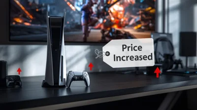
Price Increase for Sony PS5 in Southeast Asia Effective May 1
Sony announces a price increase for the PS5 across Southeast Asia starting May 1, 2026, impacting ga

Potential ‘Super El Niño’ in 2026: Understanding the Climate Risks
Could a Super El Niño emerge in 2026? Discover its implications and potential global climate impacts

Global Energy Crisis Intensifies: Markets React to Oil Supply Challenges
Markets are on edge as oil disruptions escalate, influencing prices and economic stability. Explore

Must-See Tourist Spots in London You Can't Overlook
Explore London's essential attractions, from royal landmarks to vibrant markets, ensuring an unforge

Ultimate Guide to Snagging Cheap Flights in 2026
Unlock the secrets to booking affordable flights in 2026 with insightful tips and strategies tailore